
 It is important for me to have a lot of home comforts around me when I work and also a lot of imagery to look at, who likes a blank wall? Decoration is key in my life and I love my new room, especially my desk and work area.
Wednesday, 30 September 2009
Home Sweet Home...
It is important for me to have a lot of home comforts around me when I work and also a lot of imagery to look at, who likes a blank wall? Decoration is key in my life and I love my new room, especially my desk and work area.
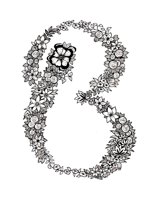
The Ugly Bug Ball...
 My friend Coops and I have had a joint birthday party the past two years since meeting at University as her birthday is the day after mine. In true student style, there is always a theme and there is always fancy dress as we love to dress up. This year, we were thinking of having an Ugly Bug Ball, it would be challenging to dress up and also so much fun to fill the flat with giant flowers and leaves and make us feel really small! I was daydreaming about it and my inky hands started doodling again...
Greetings...
Over the Summer, whilst spending time in the Lake District at my Dads, I filled my evenings of no TV or Internet by making Greetings cards of all kinds.
 This is a Thankyou card I made for my Dad for buying me my B.E.A.U.T.I.F.U.L desktop Mac. It was a very happy day.
 The top image is the inside of the card, the bottom is the front, just saying thank you to my Dad for letting us stay in his flat for seven weeks... I wanted to use my calligraphy pen but illustrate colloquial language.
 This was my Dads birthday card, its very personal as he loves the Penguins in Madagascar, is nicknamed 'Pikey' and has always wanted a Pig Farm... so i incorporated all these into one card.
  This was the Fathers Day card I made a while ago, one of the first attempts at card making and I hope I have definitely improved since!
This was the card I made for my Dads friend Sally, for her 40th Birthday. It took me a reaaaally long time as I had a fine line pen for the details which I then had to go round again in gold. The detail was tiny and very time consuming but I am happy with the result.
I don't think this is something I can develop into my 3rd Year but it is a keen hobby. I love being crafty and I have always felt hand made cards are far more personal.
And Next...
I moved back to Loughborough a few days ago now and I'm pretty comfortable and settled in, apart from the first new flounces of paying everyone and the cats mother for all sorts and getting my work together. Similarly, I'm pretty comfortable and settled in with the area of work i'll progress with this year, I've done a fair bit of research and doodles I just need to compose a few potential briefs and refine some images with colour and pattern etc. We shall see. It's all very exciting though, I'm thinking of definitely exploring some advertising campaigns or some re-branding of some kind, I'd also like to apply myself for some competitions and live briefs as well as then I can see where my work stands commercially. I'd definitely love to get involved with the Daydream Network too.
Inky Hands...

I became quite accustomed to just sitting writing random things that popped into my head with my ink pen, it definitely became attached to my wrist, hence the permanently stained fingers! I have also been stalking the website and blog of my absolute favourite Illustrator of all time, Sarah Coleman, who I only discovered recently. Her work is absolutely amazing, it makes me just to want write and write and write with my pen (she uses brush). So that I did.
 I got a lot of reference from various Art Nouveau books, such as these panel designs, adapted from 'Modern Ornament', by H.Summerfield Rogerson, c.1900.
 I got a lot of reference from various Art Nouveau books, such as these panel designs, adapted from 'Modern Ornament', by H.Summerfield Rogerson, c.1900.
I tried drawing with ink too which is the perfect tool to create the curls and swirls trademarks of the art Nouveau movement. I really love referencing birds, fish, flowers and trees and nature in general really.

I also picked out details of pattern that caught my eye, like this for example, 'Dogess In Black' by Vittorio Zecchin, 1913.
All Things Summer...
After definitely deciding 10000% I would love to stick to typography, the decorative hand rendered kind not the graphic kind, I spent a good while rifling through old fashion adverti
sements and my fashion illustration books because advertising is always something I've been interested in. I especially love the early 1900's in terms of fashion design itself and fashion illustration, as clothing was informed more by the sinuous aesthetic of the Art Nouveau style, than by any hint of modernity. The fashionable aristocratic and wealthy elite of Europe and North America were swathed in lace, frills and flounces, feather boas and picture hats adorned with birds of paradise or flowers. Dress signified status and and lavish expenditure on clothes epitomized the culture. Therefore fashion illustration itself was as aesthetically moribund as fashion itself, as Illustrators working for high-end fashion magazines such as 'American Vogue' and 'Harpers Bazar' adhered to depicting the dress in often pedantic detail.

I exercised my calligraphy pen and inks and tried repeating some of the typography I was referencing, such as french magazine 'Monsieur' and 'Femina'.

I usually spend so ridiculously long on my work and am generally very pedantic about it so I thoroughly enjoyed having the excuse that it was relevant I spent 3 days on one piece in an a5 sketchbook! It was also appropriate that my addiction to 'pretty' wrapping papers could be included as I could pick out references to nature and animals such as birds.


Aside from the typography side of early 1900's fashion illustration, I really love the work of Jacques Demachy, Rene Gruau, Bernard Blossac because of the sense of sophisticated mystery within the drawings.
I continued to look into the later 1900's, especially the 1960's-1980's when the illustration became more urban and less decorative, however I loved how the fashion advertising developed so much more colour and texture, the more pattern, colour and texture, the better! The 'Club Culture' of Jo Brocklehurst really inspired me as the 'feminine' details of early 1900 fashion became more masculine - less feathers and frills, more studs and metallics. Likewise the sophisticated typographic accompaniments became more provocative slogans. This was very inspirational to me and definitely cemented in my mind that it is the kind of world I am most comfortable living in.
Subscribe to:
Posts (Atom)
