

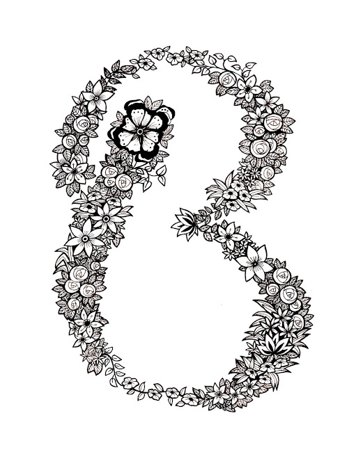
Ideas for the redesigning of 'Buster Books' titles 'The Girls Book' and 'The Boys Book'. These are the typographic elements however I think there is more to do with these...


 Below are my final designs, the top takes the form of vinyl, framing the store window and the bottom is a backdrop for display within the window or shop, using an autumn colour pallete. I chose to compose elements of a campaign with the intention of Ted Baker deciding on specifics like manikins, props, and promotional deals. All these things were explored in my sketchbooks however I came to the judgement that those details were not necessary for me to decide on when I could purely work on aesthetic qualities.


